EYES WITHOUT A FACE
☞ The idea of a metaphor is, essentially, an understanding of one kind of thing in terms of another. The early hominid traced relational dynamics between various expressions, objects, and symbols in order to develop language. In time, we were able to both comprehend and respond to reality using abstract representations. As social rituals formed, and we became more complex, linguistic beings, we were entrenched so deeply in language that humans are thus a species of symbol. Symbolic language has literally shaped the sort of biological organism that we are.1
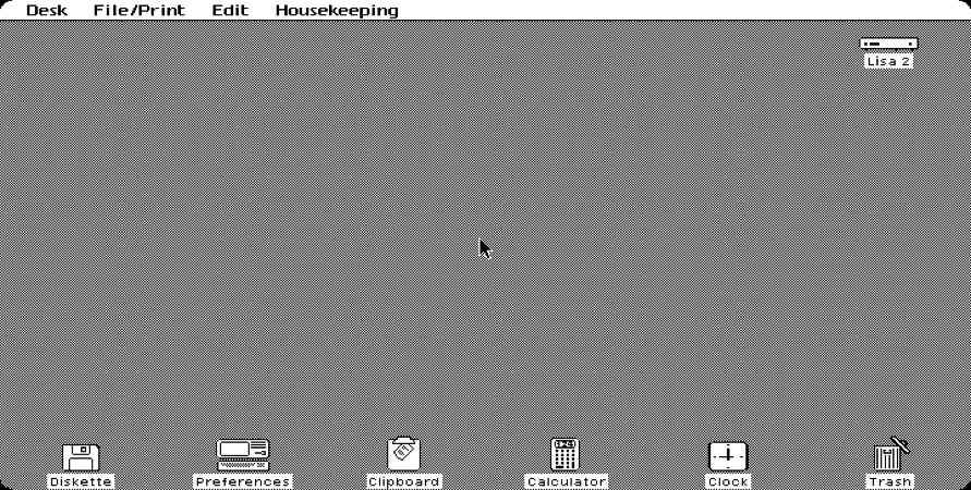
Since its inception in the late 1960s and early 70s, computational culture has played on symbolic thinking, the very cognitive processes we use to discern between objects and determine intention. The graphical user interface (GUI) became the earliest practical mode of personal computing available when Apple incorporated one into the Apple Lisa in 1983.2 Lisa stood for “Local Integrated Software Architecture,” and predated the consumer-oriented operating system popularized by Microsoft, Windows 95, with its use of symbolic icons for various functions. The GUI has long imposed a seeming openness, or directness, that serves as the quiet backdrop of all applications—as a surface on which all data are manipulated. The presentation of familiar desktop paraphernalia on early user interfaces like Apple Lisa, or Windows 95, made their capabilities quite clear: files were neatly tucked into folders, scraps were tossed into recycling bins, or disposed of in trash cans, and other accessories like notepads, clocks, and calculators were carefully replicated in two dimensions. Not only could the human mind’s relentless search for metaphor be satiated by this abstract semiotic plane, the entire visual system presumably made new users more accustomed to interacting with it. A great deal of intent influenced precisely how users would interact with these devices—how we would scroll, allocate attention, click through menus, and operate displays that utilize symbols as part of a broader suite of functions. As Alexander Provan writes in his essay “Gestural Abstraction,” “The graphic interface granted the user unparalleled control by cloaking the actual computing—which was, of course, in no small part controlling the user. Interactions supplanted inputs; work muddled leisure.”3 Computer developers across platforms strived to create operating systems that were metaphorically intuitive, and therefore commercially successful, but this also afforded them with a certain degree of authority. They had a unique ability to determine which symbols and gestures would be classified as “neutral,” and, subsequently, accessible, or useful, to most users.
Graphical operating systems are often undergirded by an assumption that metaphors are a good way to cope with the digital world. After all, we “stream” content and share “links.” When software fails us, it “crashes.” We continue to send “e-vites” and “e-mails” that have never actually required an envelope, despite the many images that suggest a material referent. Minute graphical cues like drop shadows suggest that icons are floating, that pages are cascading, that windows are literally opening to new vistas, and that there are yet more symbols hiding just beyond the currently active view. Of course, operating systems themselves have no use for metaphors. Their inclusion, both in graphic and larger systemic design, has always been a consolation to us—the human operators who engage them ubiquitously, and unwittingly.
Our interpretations of symbols are influenced as much by context as they are by the symbol’s own design. Therefore, design decisions have had to consider the variables affecting individual symbols (for example, size and hue) as well as the semantic relationships between multiple symbols. The desktop metaphor, for instance, relies on the proximity of other items on the desk to encourage the accuracy of visual search tasks, and affect the rate at which symbols are located. A phone symbol might equally indicate an outgoing call function, or contact information, or customer service availability. It is the presence or absence of a leather-bound address book that makes further deduction possible. In the early days of computational culture, these visual metaphors were introduced to make operating systems more palatable to a host of unseasoned users. The one-to-one relation between an icon and its function deliberately evaded symbolic ambiguity. As Wendy Hui Kyong Chun elaborates in On Software, or the Persistence of Visual Knowledge:
 By typing in Word, letters appear on my screen, representing what is stored invisibly on my computer. My typing and clicking seem to have corresponding actions on the screen. By opening a file, I make it visible. On all levels, then, software seems to be about making the invisible visible—about translating between computer-readable code and human-readable language.4
In order to simplify this translation, each digital cue was illustrated by the graphic quintessence of its potential. This laid the foundation for a more harmonious relationship between human and interface. As we examine the ways in which we’ve co-evolved with our interfaces, each new machine intelligence ushered in by a deeper level of symbolic interaction, what becomes prevalent is a consistent aim to seamlessly mediate across sensation, cognition, and computation. From early GUIs, to haptic screens, and, increasingly, artificial intelligences, our banal digital compulsions have been made to feel perfectly inconspicuous, and utterly natural. Nevertheless, these very interactions have slowly reshaped both communication and self-conception, resurfacing as vastly commodifiable networks of information.
☟
Skeuomorphism is the term assigned to design elements that derive refefences, or retain attributes, from a separate, often analog, original. Its etymon combines the Ancient Greek skeûos, or “vessel”, with morphe, “form.” Instances of skeuomorphism can also occur IRL, for instance, when wooden veneer panels are applied to vehicle doors to recall wagons, or when decorative “rope” is replicated in ceramic trim. The metaphorical face of the desktop uses skeuomorphs in various arrangements to signal that its visual data is manipulable, and to show precisely how.
Skeuomorphs are not necessarily literal and, at times, barely perceptible. The predictable camera shutter that sounds when a digital photo is captured can be considered an audible skeuomorph. The moment a photograph is taken, the device’s brief click kindly alerts you to its temporary quality of “camera.” Even as aesthetic textures such as the iPhone’s pine bookshelves for “iBooks,” or felt green tabletops for “games,” began slowly receding into the speculative background, application icons maintained a certain reflective quality. Gradients and bevelled borders act as obligatory signifiers for the utility of the symbol itself: a “button.” Skeuomorphs, importantly, indicate that a graphic is touchable by invoking a tactile response that parallels our experience of the physical world: pressing buttons in elevators, or flicking light-switches and toggles.
The human interface guidelines provided by Apple for its developers even pose requirements for the size and quality of the graphic icon, which consider the user’s ability to see a symbol just as much as the device’s ability to recognize a fingertip when it is touched.5 In the late Steve Jobs’ vision, adding a life-like physicality to the graphic operating system was not only instrumental in acclimating both users and devices, it also captivated us: it delighted our senses. Minimizing user labor to the degree that digital self-expression remain a delightful, subconscious act persists as an industry standard.
☟
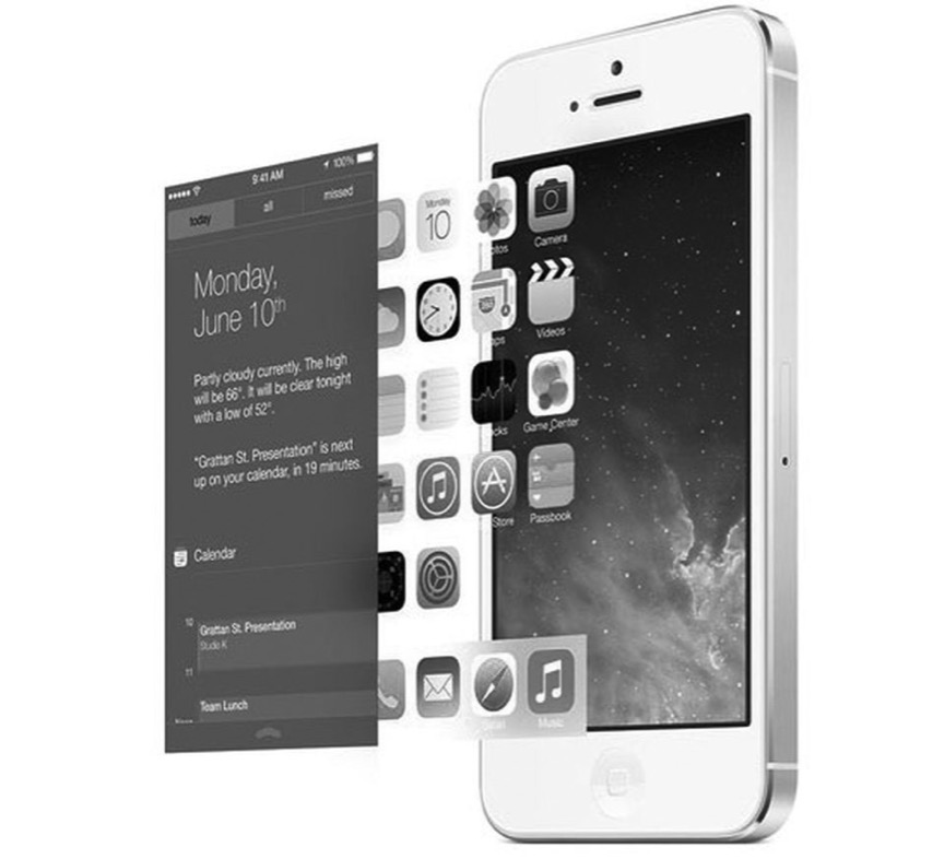
Skeumorphism pervaded interface design until the early 2010s; The graceful shift that proceeded thereafter has been exhaustively chronicled by technologists and design enthusiasts alike. At the 2013 Worldwide Developers Conference in San Francisco, Apple’s chief design officer, Jony Ive, introduced the iPhone software that would dramatically overhaul the visual landscape of Apple’s mobile system: iOS 7.6 In this new era, each of the individual, skeuomorphic cues would vanish in favor of a flatter, more dynamic surface. The green felt was gone. The interface was completely renewed, yet entirely familiar. It was unobtrusive and deferential. It did away with contours and shadows, providing, instead, a depthful, parallax effect that overlaid icons and notifications with the luminary translucence of whatever was running quietly beneath them. In essence, it amounted to a significantly more stacked, or layered, user experience. While the impetus for skeuomorphs was to convey simplicity through direct correlation, this abstract refacing granted devices a new illusion of simplicity, whose basis relied on lightness and transparency. As media theorist Alexander Galloway argues, “Any mediating technology is obliged to erase itself to the highest degree possible in the name of unfettered communication, but in so doing it proves its own virtuosic presence as technology, thereby undoing the original erasure.”7 Innovation seems to require that the interface interfere with the human experience as little as possible—that it quietly coalesce with other objects, surfaces, and spaces in the very announcement of itself.
☞ Today, we furl ourselves around each newly minted artifice in collective blindness, as though it bears no consequence to reality. That the interface can seem so logical, transparent, and objective when it is in fact meant to elicit an instant, and profound, emotional response is its true feat of design. The model of the desktop metaphor has decidedly been traded out by most personal computing systems in recent years. Computing, mobile or otherwise, has adopted an entirely new metaphor whose basis lies in seamless, ever-present connectivity: the cloud. The cloud is a network of remote servers hosted on the internet, used to store and process information. In this paradigm, data is no longer bound to a single system, but dispersed across networks. As Tung-Hui Hu writes in A Prehistory of the Cloud, “The word ‘cloud’ speaks to the way we imagine data in the virtual economy traveling instantaneously through the air or ‘skyway’—here in California one moment, there in Japan the next.”8 By providing a seemingly instant, unmediated relationship between user and interface, the cloud aids our contemporary imagination in eluding the hard infrastructure of the network. Unlike its predecessors, the cloud metaphor takes an upward bias—a comforting, intangible quality that allows our memories to ascend to a customized digital utopia. The cloud is the new frontier in which contemporary culture saves itself.
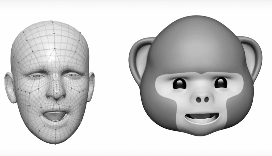
The 11th major release of the iOS mobile operating system now allows users to both store and access files across a number of cloud services. Its integrated intelligent personal assistant, Siri, can even learn more about its user to better suit their individual needs. The “animoji” feature, available only via the iPhone X TrueDepth camera, responds to the user’s facial expression to create three dimensional animations. These are the artificial voices that gently guide us through our daily conversations and end user agreements. Indeed, the conversational voice of user interfaces, or VUIs, behind our digital assistants are arguably the latest frontier for the long-forgotten skeuomorph: they provide software with certain vocal characteristics associated with humans to suggest affect, empathy, or reliability. In their clever mimicry of human relationships through approval, humor, and attentiveness, artificial intelligences seem to satisfy both our appetite for metaphor and innate fixation with anthropomorphism.
☟
What beliefs do we unknowingly express to our devices? The amount of time and emotional energy that we devote to these beautifully responsive, handheld artifacts is unprecedented. The proverbial “face” of technology can prey on our deepest impulses‚ conveying attitudes and voices that correspond with the vulnerabilities of human cognition; the very processes of metaphor and semblance that we’ve established to discern expression, and build trust. Our encounter with this face is not magical, nor equal, nor particularly readable. One could say the relationship is one-sided, requiring only that we engage continuously with a luminous, manufactured surface that does not, and could not, reciprocate our empathy. Despite eager attempts made by artificial intelligence to compliment us, to autocorrect us, to simulate and finish our sentences, its voice must remain neutral and even-tempered. Its embedded moral character—its goals—remain concealed beneath a vague facade of interest and understanding.
If we are indeed linguistic beings—history’s primed subjects of language, and symbol—it is worth questioning what these attempts of digital mimicry are beginning to do to us. Our preoccupation with retina screens, manufactured motions, and increasingly sophisticated vocal commands must have some bearing as we continue to coevolve with our devices. Misreading the metaphorical face of technology comes at a price. We find ourselves caught in a habitual relationship with an intelligence that simuates, and even entwines, bits of our relations with other people; we have grown to rely on it.
We have to recognize, at least on some level, the degree to which banal algorithms have begun to comprise the phenomenological texture of our reality; how they are implicated in every part of our interaction with both humans and non-human devices. Gradual shifts in skeuomorphism, and interface design, move us away from hard, material analogs, and closer to technology itself. But as devices and AI have gone on to mimic human traits, and gesture at personalities with such tactful precision, we have also begun to lull ourselves into believing in the presence of some kind of moral conscience.
Chun questions, in On Software,
What is software, if not the very effort of making something explicit, or making something intangible visible, while at the same time rendering the visible (such as the machine) invisible?
The verb “screen” can mean either “to show” or “to hide.” The presumed simplicity we find across skeuomorphic designs, multi-touch interfaces, and other artificial intelligences engender a peculiar ethos of technology, that is, to intentionally remain both seen and unseen. And in so doing, it better functions as a semantic system designed both to identify and prescribe, while remaining willfully detached from the acts of identification and prescription.
- 1. See Jodi O'Brien, The Production of Reality: Essays and Readings on Social Interaction, 5th ed. (n.p.: SAGE, 2011), 65–70.☝︎︎
- 2. Christoph Dernbach, “Apple Lisa,” Mac History, accessed January 31, 2018, http://www.mac-history.net/apple-history-2/apple-lisa/2007-10-12/apple-lisa.☝︎
- 3. Alexander Provan, “Gestural Abstractions,” Artforum, March 2013.☝︎
- 4. Wendy Hui Kong Chun, “On Software, or the Persistence of Visual Knowledge,” Grey Room no. 18 (Winter 2005): 26-51, https://www.mitpressjournals.org/doi/10.1162/1526381043320778 (accessed November 21, 2017).☝︎
- 5. Apple Inc., “iOS Human Interface Guidelines,” 2013, https://www.scribd.com/document/147098809/iOS-Human-Interface-Guidelines (accessed November 21, 2017).☝︎
- 6. Kyle Vanhemert, “See Apple’s Remarkable Evolution From iOS 6 To iOS 7,” Fast Co. Design, June 10, 2013. https://www.fastcodesign.com/1672796/see-apples-remarkable-evolution-from-ios6-to-ios-7#1 (accessed November 21, 2017).☝︎
- 7. Alexander Galloway, The Interface Effect (Cambridge, UK: Polity Press, 2012), 62.☝︎
- 8. Tung-Hui Hu, A Prehistory of the Cloud (Cambridge, Massachusetts: The MIT Press, 2015), XII.☝︎
- References
- Bragdon, Andrew, Ken Hinckley, Yang Li, and Eugene Nelson. “Experimental Analysis of Touch-Screen Gesture Designs in Mobile Environments.” In Proceedings of the 2011 annual conference on Human factors in computing systems, Vancouver, BC, May 7–12, 2011. https://static.googleusercontent.com/media/research.google.com/en//pubs/archive/37157.pdf (accessed November 14, 2017).
- Burigat, Stefano, and Luca Chittaro. “Visualizing references to off-screen content on mobile devices: A comparison of Arrows, Wedge, and Overview+Detail.” Interacting with Computers 23, no. 2 (March 2011): 156-66.
- Czerwinski, Mary and Victor Kaptelinin. "Introduction: The Desktop Metaphor and New Uses of Technology." In Beyond the Desktop Metaphor: Designing Integrated Digital Work Environments. Cambridge, Massachusetts: The MIT Press, 2007.
- Galloway, Alexander. The Interface Effect. Cambridge, UK: Polity Press, 2012.
- Hu, Tung-Hui. A Prehistory of the Cloud. Cambridge, Massachusetts: The MIT Press, 2015.
- Hui Kong Chun, Wendy. “On Software, or the Persistence of Visual Knowledge.” Grey Room. 18 (Winter 2005): 26-51. https://www.mitpressjournals.org/doi/10.1162/1526381043320778 (accessed November 21, 2017).
- MacEachren, Alan M., Anthony C. Robinson, and Joshua E. Stevens. “Designing Map Symbols for Mobile Devices: Challenges, Best Practices, and the Utilization of Skeuomorphism.” In: Proceedings of the 26th International Cartographic Conference, Dresden, Germany, 25–30 (2013).
- O'Brien, Jodi. The Production of Reality: Essays and Readings on Social Interaction. 5th ed. N.p.: SAGE, 2011.
- Provan, Alexander. “Gestural Abstractions.” Alexander Provan. 2013. http://www.alexanderprovan.com/2013/03/01/gestural-abstractions/ (accessed January 27, 2018).
- Vanhemert, Kyle. “See Apple’s Remarkable Evolution From iOS 6 To iOS 7.” Fast Co. Design, June 10, 2013. https://www.fastcodesign.com/1672796/see-apples-remarkable-evolution-from-ios6-to-ios-7#1 (accessed November 21, 2017).